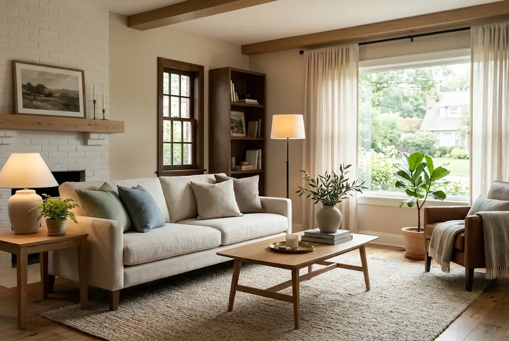
The Ultimate Comfort Palette: Redefining Relaxation Through Color and Design
A comfortable home is not created by furniture alone. Color, texture, lighting, materials, and the arrangement of everyday objects all influence how a room looks and feels. When these elements work together, an ordinary interior can become a welcoming retreat where relaxation feels natural.
The ultimate comfort palette is built around this idea. Rather than treating color as a purely decorative choice, it uses calming tones, tactile materials, warm lighting, natural elements, and personal details to create an environment that feels peaceful and inviting.
The approach is flexible enough for a minimalist apartment, a traditional home, a rustic interior, or a contemporary living space. The goal is not to follow one rigid decorating style but to create surroundings that support comfort and reflect your personality.
What Is a Comfort Palette?
A comfort palette is a coordinated selection of colors and design elements chosen to create a particular emotional atmosphere within a room.
Instead of selecting colors independently, the palette considers how wall colors, furniture, fabrics, flooring, accessories, and lighting interact. A carefully coordinated combination can make a room feel softer and more cohesive without requiring a complete renovation.
The original concept behind the ultimate comfort palette emphasizes warm neutrals, muted nature-inspired colors, tactile materials, layered lighting, and intentional decoration.
Why Color Matters in Interior Design
Color is one of the first things people notice when entering a room. It can influence the visual temperature, perceived atmosphere, and overall character of a space.
Warm neutrals such as beige, cream, ivory, taupe, and soft brown can create an understated and welcoming foundation. Cooler muted shades such as dusty blue, sage, and soft gray can introduce a quieter, nature-inspired feeling.
The most effective approach is usually not to cover an entire room with one color. Instead, use a dominant base, supporting tones, and carefully selected accents to create visual balance.
Warm Neutrals
Warm neutrals are versatile because they can make a room feel comfortable without overwhelming the rest of the design. Cream, warm white, beige, taupe, and soft sand tones can work particularly well as wall colors or large furniture finishes.
These shades also provide a flexible background for wood, plants, artwork, textiles, and decorative accessories.
Soft Blues
Muted blues can bring a sense of openness and calm to an interior. Dusty blue, powder blue, and soft gray-blue can work well in bedrooms, reading corners, bathrooms, and living areas.
Because stronger blues can become visually dominant, softer versions are often easier to combine with neutral furnishings.
Sage and Muted Greens
Sage green connects an interior visually with the natural world. It can work as a wall color, upholstery shade, accent color, or decorative detail.
Pairing sage with warm wood, cream textiles, and natural materials can create a balanced organic look.
Earth-Toned Accents
Caramel, terracotta, clay, muted ochre, and warm brown can add depth to a neutral room. These colors work particularly well through cushions, rugs, artwork, ceramics, or smaller furniture pieces.
Build the Palette Around a Cohesive Base
One of the easiest ways to create a comfortable interior is to establish a clear base color before adding accents.
Start with the largest visual surfaces, such as walls, flooring, curtains, or major furniture. Once those elements establish the foundation, introduce secondary colors through textiles and accessories.
A palette of roughly five to seven coordinated colors can provide enough variety without making the room feel visually chaotic. The original HorizonNote concept also recommends working within a cohesive range of nature-inspired shades.
Texture Makes a Room Feel More Comfortable
Color creates visual atmosphere, but texture adds a physical dimension to comfort. A room can have beautiful colors and still feel cold if every surface is hard, glossy, or visually uniform.
Layering different textures makes an interior feel more inviting.
Soft Fabrics
Throws, cushions, curtains, upholstered chairs, rugs, and bedding can introduce softness. Linen, cotton, wool, and textured woven fabrics are especially useful for creating visual and tactile variety.
Natural Materials
Wood, jute, rattan, stone, ceramics, and other natural-looking materials can help ground a color palette.
For example, a cream-colored living room can feel significantly warmer when paired with natural wood furniture, woven baskets, a textured rug, and greenery.
Mix Smooth and Rough Surfaces
Comfort does not mean every object needs to have the same texture. Combining smooth ceramic with woven fabric, polished surfaces with raw wood, or soft upholstery with a natural fiber rug can create a richer interior.
Lighting Can Transform Your Comfort Palette
Even the right colors can look completely different under different lighting conditions. This is why lighting should be considered part of the overall design rather than an afterthought.
The original article emphasizes warm, layered lighting and notes that warm-white bulbs around 2700K can create a softer evening atmosphere.
Ambient Lighting
Ambient lighting provides the general illumination of a room. Ceiling fixtures, wall lights, and other broad light sources can establish the overall brightness.
Task Lighting
Task lighting provides focused illumination for activities such as reading, working, cooking, or getting ready. Table lamps and floor lamps can provide useful pools of light without illuminating the entire room equally.
Accent Lighting
Accent lighting can draw attention to artwork, shelving, architectural details, plants, or decorative objects. Used carefully, it adds depth and prevents a room from appearing visually flat.
Use Light to Support the Color Scheme
Lighting should complement the palette rather than fight against it. Warm lighting can enhance beige, cream, caramel, brown, and other warm tones, while cooler daylight can reveal the blue or green undertones within certain colors.
Before committing to a major wall color, test samples under both daytime and evening lighting. A shade that looks perfect in afternoon sunlight may appear noticeably different after sunset.
Design for Emotion, Not Just Appearance
The strongest comfort-focused interiors are designed around how people want to feel in the space.
A living room may be intended for conversation and relaxation. A bedroom should encourage a quieter atmosphere. A reading corner may benefit from comfortable seating, focused lighting, and a restrained color scheme.
Thinking about the purpose of the room before choosing colors can help create a more intentional result.
Create a Sense of Calm
Use restrained colors, soft textures, comfortable furniture, and controlled lighting when the goal is relaxation.
Create Warmth
Warm wood, earthy accents, layered fabrics, and warm lighting can make a large or neutral room feel more intimate.
Create Energy Without Losing Comfort
If a room feels too subdued, introduce a few stronger accents rather than replacing the entire palette. A deep green cushion, muted terracotta artwork, or warm ochre accessory can add personality without overwhelming the foundation.
How to Create a Comfort Palette in a Living Room
The living room is often the best place to experiment with a comfort-focused palette because it combines relaxation, entertainment, conversation, and everyday family activity.
Begin with a neutral foundation for the walls and larger furniture. Add warmth through a rug, curtains, cushions, and wooden elements. Then introduce one or two accent colors through artwork or smaller accessories.
For additional inspiration, explore HorizonNote’s guide to cozy living interior ideas, which complements the comfort-focused approach to residential design.
Creating a Comfortable Bedroom
A bedroom benefits from a calmer and more restrained palette. Soft beige, warm white, muted blue, sage, dusty gray, and natural wood can work well as a foundation.
Textiles are particularly important here. Layer bedding with different fabrics and subtle shades rather than relying on a single flat color.
Lighting should also be easy to adjust. Bedside lamps, dimmable fixtures, and softer evening illumination can make the room feel more relaxed as the day winds down.
Comfort in Small Spaces
A small room does not need to feel cramped. Color and material choices can help create visual continuity and make the available space feel more intentional.
Using related shades across walls, furniture, and textiles can reduce visual fragmentation. Mirrors can reflect light, while lighter colors can help maintain an open appearance.
For practical solutions, HorizonNote’s guide to interior hacks for compact homes offers related ideas for making smaller spaces more functional.
Minimalism and Comfort Can Work Together
Minimalism does not have to mean an empty or sterile room. A carefully edited interior can still feel warm when it combines comfortable materials, natural colors, thoughtful lighting, and a few meaningful objects.
The key is intentionality. Instead of removing everything, keep the items that contribute to function, comfort, or personality.
HorizonNote’s guide to minimalist living explores this idea in greater depth and provides a natural companion to a comfort-focused design approach.
Bring Nature Into the Palette
Nature provides an easy source of color inspiration. Think of warm sand, weathered wood, stone, soft sky blue, moss, sage leaves, clay, and dried grasses.
These colors can be combined without appearing overly coordinated because they already occur together in natural environments.
Plants can reinforce the effect. Beyond adding green, they introduce organic shapes and visual movement that can soften rooms dominated by straight architectural lines.
Organic Shapes Add Softness
Comfort-focused design does not have to rely entirely on color. Rounded furniture, curved mirrors, sculptural ceramics, arched details, and organically shaped accessories can soften the geometry of a room.
Combining organic shapes with natural materials can make a space feel less formal and more relaxed.
Choose Finishes That Support the Mood
Surface finishes influence how color is perceived. Highly reflective materials can make colors appear brighter and more dramatic, while matte finishes tend to create a softer visual effect.
Matte walls, textured fabrics, brushed metals, natural wood, and handmade ceramics can work particularly well in comfort-oriented interiors.
This does not mean glossy materials should be avoided entirely. A few carefully selected reflective surfaces can provide contrast and prevent a soft palette from becoming visually flat.
Personal Details Make the Space Feel Like Home
A room can be beautifully designed and still feel impersonal if every object looks selected from the same showroom.
Photographs, books, artwork, handmade pieces, travel souvenirs, family objects, and other meaningful items can give the space personality.
The goal is not perfect coordination. A comfortable home should reflect the people who actually live there.
Common Comfort-Palette Mistakes
Using Too Many Colors
Adding a new accent color every time you purchase an accessory can quickly make a room feel disconnected. Establish the main palette first and use new colors selectively.
Making Everything Beige
Neutral does not have to mean flat. If every surface has a similar tone and texture, the room may lack depth. Introduce variation through wood, fabric, greenery, artwork, and subtle accent colors.
Ignoring Natural Light
Color should always be evaluated in the actual room where it will be used. Window direction, daylight intensity, artificial lighting, and surrounding colors can change how a shade appears.
Choosing Style Over Comfort
A beautiful chair that is uncomfortable will not create a relaxing room. Furniture should support the way the space is actually used.
Overdecorating
Comfort requires visual breathing room. Too many accessories can make even a carefully selected palette feel chaotic.
How to Build Your Own Comfort Palette
You do not need to redesign an entire home at once. A simple process can help you develop a cohesive palette gradually.
- Choose a base: Start with one or two dominant neutral or nature-inspired shades.
- Add supporting colors: Select two or three complementary tones.
- Introduce contrast: Add one deeper or warmer accent to create definition.
- Layer textures: Combine fabric, wood, ceramics, rugs, and other tactile materials.
- Improve lighting: Use ambient, task, and accent lighting rather than relying on one fixture.
- Add nature: Introduce plants, natural materials, or nature-inspired artwork.
- Personalize: Finish with objects that have genuine meaning to you.
A Comfort Palette Can Adapt to Different Styles
One of the advantages of this approach is its flexibility. The same principles can be interpreted through several interior styles.
Scandinavian-Inspired Comfort
Use pale neutrals, light wood, simple forms, soft textiles, and restrained greenery for a bright and uncluttered interpretation.
Rustic Comfort
Combine warm browns, cream, natural wood, woven materials, stone, and vintage-inspired accents for a more grounded atmosphere.
Modern Comfort
Use a restrained neutral palette with contemporary furniture, warm lighting, textured fabrics, and carefully selected artwork.
Modern Bohemian Comfort
Layer muted earth tones, plants, textiles, handmade objects, and organic patterns while keeping the overall color range coordinated.
Comfort Is More Than a Color Choice
A comfort palette works best when color is treated as one part of a larger design system. A soothing wall color cannot compensate for harsh lighting, uncomfortable furniture, clutter, or a lack of functional storage.
The most successful relaxing spaces consider the complete experience: what you see, touch, hear, and do within the room.
That is why color should be coordinated with furniture placement, lighting, texture, materials, and everyday routines rather than considered in isolation.
The Future of Comfort-Focused Interior Design
Comfort-focused design reflects a broader shift toward homes that support everyday well-being rather than simply displaying decorative trends.
People increasingly want interiors that can accommodate working, resting, entertaining, reading, spending time with family, and recovering from busy days.
That makes adaptable design especially valuable. A comfortable home does not have to be luxurious or expensive. It needs thoughtful choices that make the space work better for the people who use it.
Final Thoughts
The ultimate comfort palette is less about finding one perfect color and more about creating harmony between color, texture, lighting, materials, and personal expression.
Warm neutrals can provide a calming foundation. Muted blues and greens can bring a sense of nature indoors. Natural materials add tactile warmth, while layered lighting can transform the atmosphere throughout the day.
Start with a small area, test your colors in real lighting, add textures gradually, and keep the pieces that genuinely make the space feel good to live in.
When design choices are made with intention, comfort becomes more than a visual style. Your home becomes a place that feels welcoming, personal, and restorative every time you return.