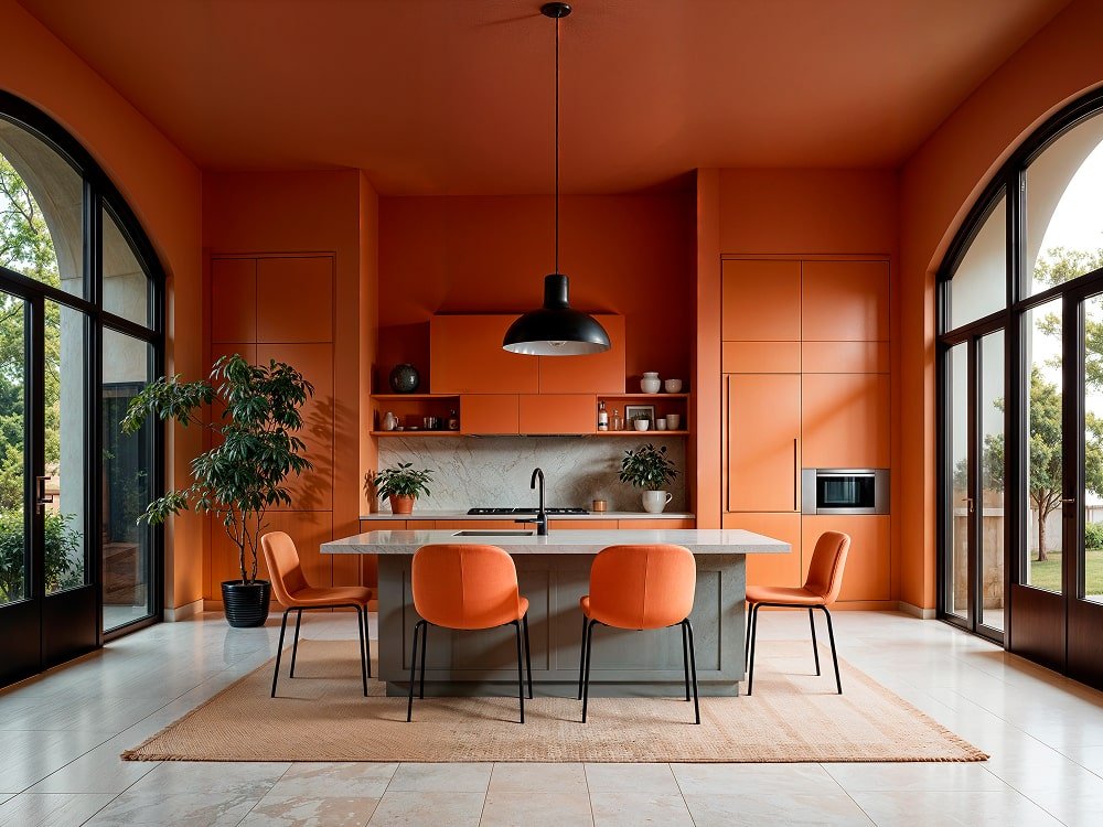
The Ultimate Comfort Palette: Redefining Relaxation Through Color and Design
** In a world that’s constantly moving, our homes have become sanctuaries of peace and restoration. The concept of **“The Ultimate Comfort Palette”** goes beyond mere color—it’s an emotional experience, a visual embrace that transforms everyday spaces into havens of serenity. This palette isn’t just about shades on a wall; it’s about how color, texture, and light blend to create the perfect mood of calm sophistication and cozy warmth. — **
The Psychology Behind Comfort Colors
** Color deeply influences our emotions. When we talk about comfort, we naturally turn to hues that soothe the senses and evoke feelings of safety. Soft neutrals like warm beige, creamy ivory, and muted taupe bring a timeless calm to any room. Cool tones—such as dusty blues, sage greens, and misty grays—reflect nature’s tranquility, inviting the mind to slow down. According to color psychology, these shades reduce stress and promote a sense of balance. Together, they form the backbone of **the ultimate comfort palette**, where every hue whispers relaxation. — **
Textures That Amplify Warmth and Ease
** Comfort doesn’t stop with color—it’s also about texture. Imagine running your hands across a chunky knit throw, a velvety cushion, or a matte ceramic vase. These tactile details heighten the cozy atmosphere. Pairing rough textures with smooth finishes, like linen curtains against sleek wooden floors, creates a dynamic that feels both grounded and luxurious. Mix natural materials—cotton, jute, wool, and raw wood—with subtle metallic accents for balance. The result is an environment that feels effortlessly elegant yet deeply human. — **
Lighting: The Unsung Hero of Comfort
** No comfort palette is complete without lighting. Harsh fluorescent bulbs can destroy the mood of even the most beautifully designed room. Opt instead for **warm, layered lighting**: soft ambient glow, gentle task lights, and the flicker of candles or fireplaces. Warm white bulbs (around 2700K) mimic the golden hue of sunlight at dusk—ideal for creating that lived-in, peaceful feeling. When light interacts with your chosen color palette, it adds depth and softness that instantly transforms the space into a cocoon of calm. — **
Designing with Emotion in Mind
** The true essence of the ultimate comfort palette lies in how it makes you feel. It’s about **designing for emotion**—for that quiet sigh of relief when you step into your living room, for the sense of safety that comes from familiar surroundings. Layer your space intentionally: start with base colors that soothe, add accent tones that uplift, and finish with details that reflect your personality. Think of caramel-toned leather chairs, powder blue cushions, or earth-toned art prints—each one adding emotional warmth. — **
Bringing It All Together: Your Personalized Comfort Zone
** The beauty of this palette is its flexibility. Whether you lean toward Scandinavian minimalism, rustic farmhouse, or modern bohemian style, the comfort palette adapts effortlessly. It’s not about following trends—it’s about building an environment that restores your spirit. To create your **personal comfort zone**, follow these tips: * Stick to **a cohesive range of 5–7 colors** inspired by nature. * Use **matte finishes** for walls and fabrics to soften light reflection. * Incorporate **organic shapes and handmade elements** for authenticity. * Add **greenery**—plants breathe life into any comfort-based space. — **
The Future of Comfort Living
** In today’s design world, comfort is the new luxury. People are shifting from cold, sterile interiors to spaces that nurture emotional well-being. The ultimate comfort palette represents that evolution—a blend of mindful design, natural hues, and intimate lighting that celebrates tranquility. In essence, **comfort has become a lifestyle**, and your home is the canvas. When every color, texture, and glow is chosen with intention, you create not just a space—but a sanctuary. — *


